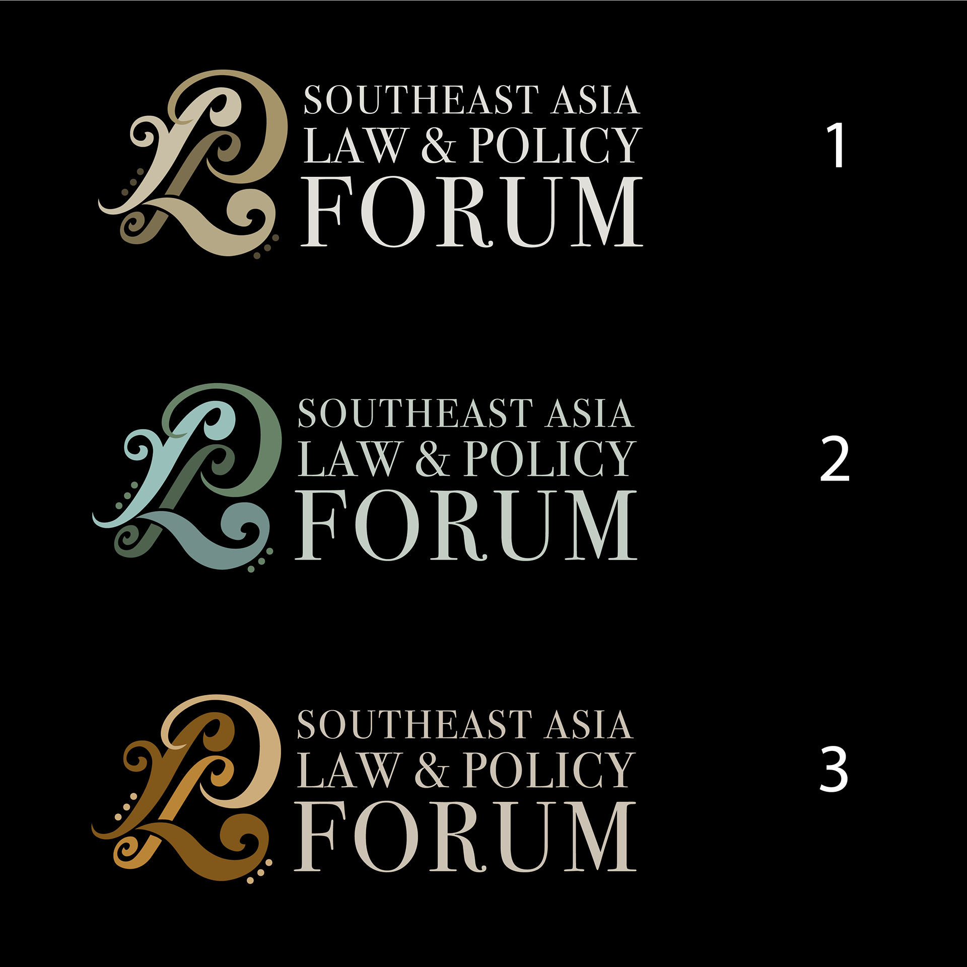
Brief: To create a logo that upholds the cultural significance of Southeast Asia (eg: Batik patterns) and steers away from cliché law symbols or buildings.
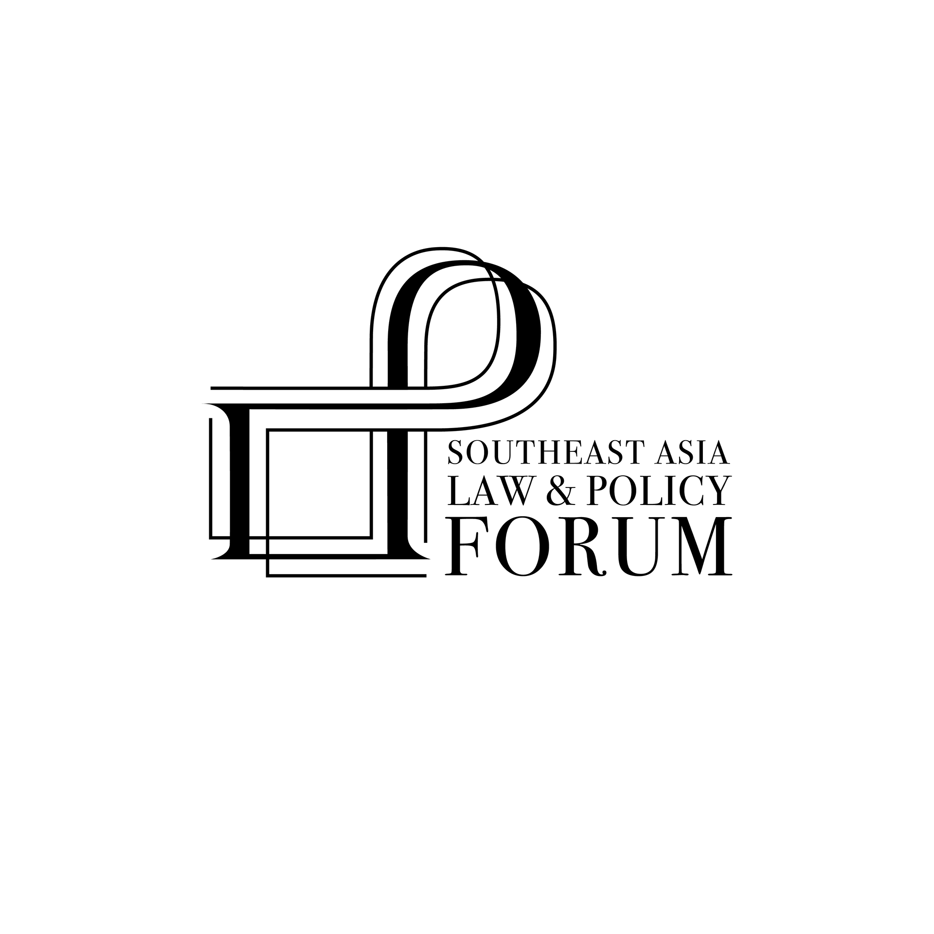
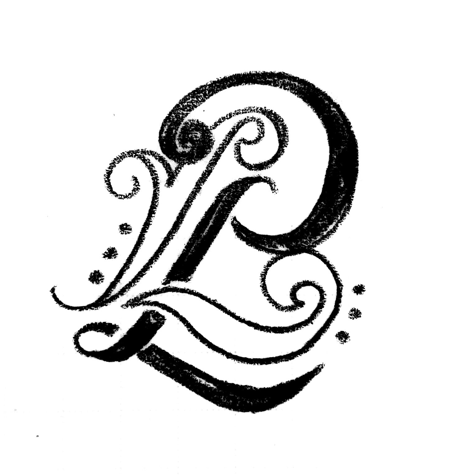
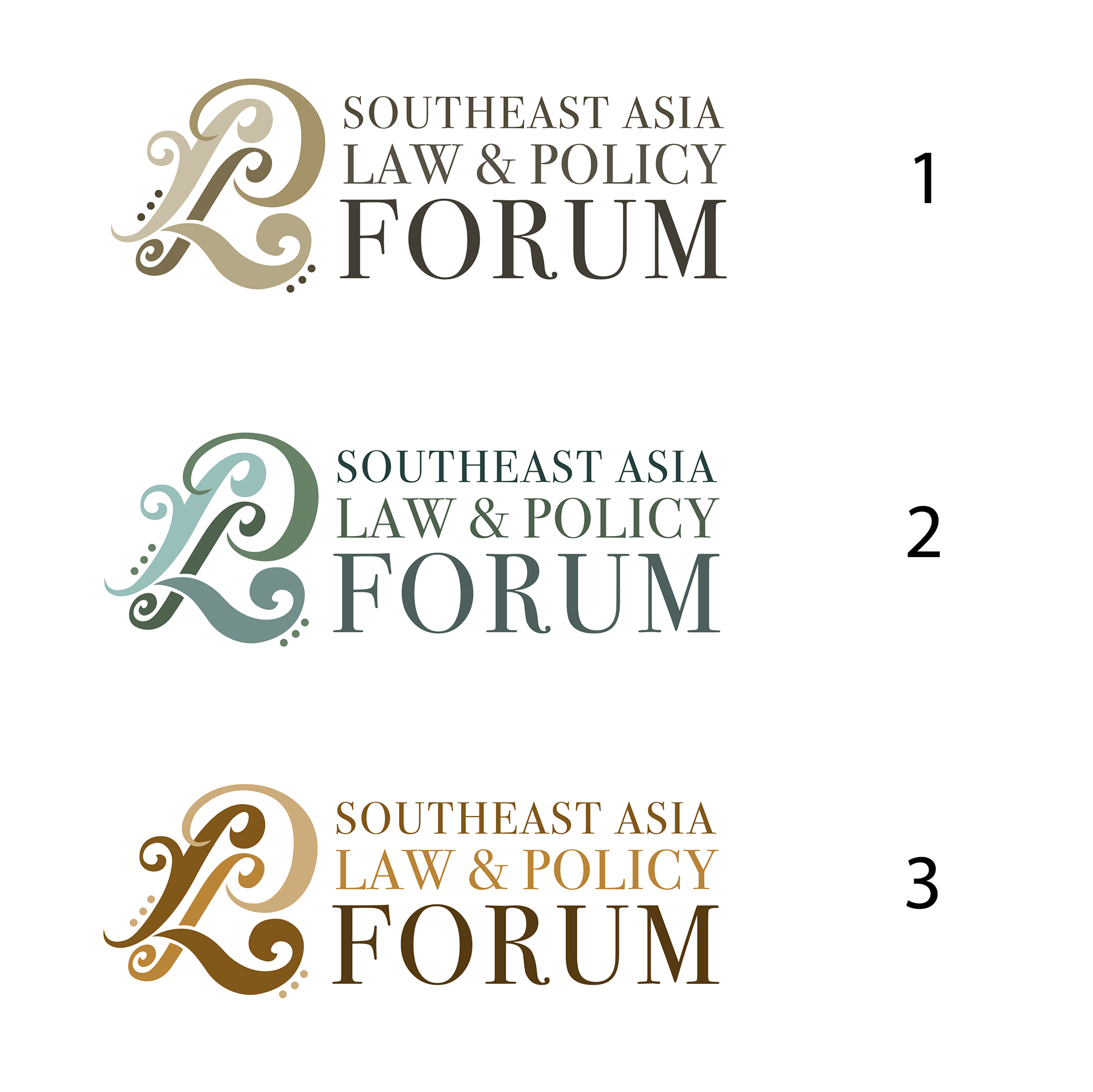
The final design draws on the aforementioned inspiration of Batik patterns, and combines it with L and P. The colours presented and chosen are neutral, earthy and relate back to traditionally used colours in Batik art. This contrasts nicely with the modern serif typeface and curves in the logo to ground the entire design as one that is cultural, yet professional.
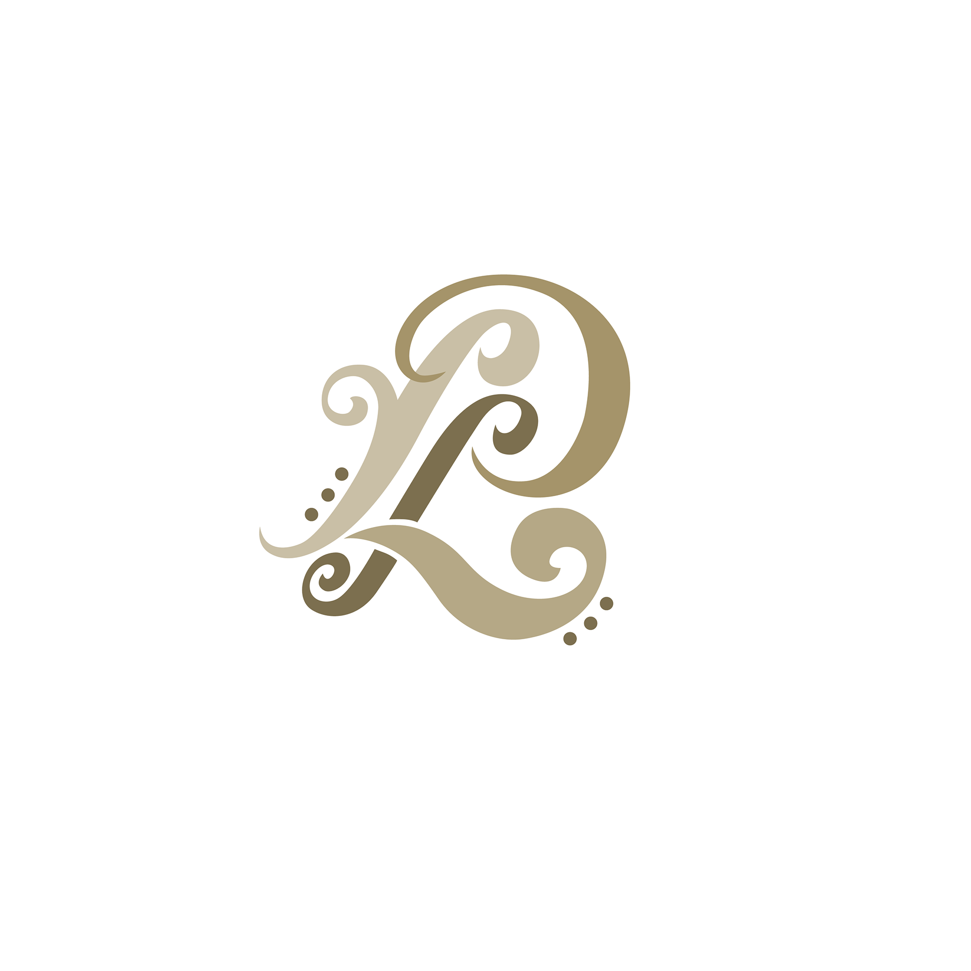
Southeast Asia Law and Policy Forum UNSW Monogram
Southeast Asia Law and Policy Forum UNSW Full Logo

Southeast Asia Law and Policy Forum UNSW Logo

Southeast Asia Law and Policy Forum UNSW mono colour logo
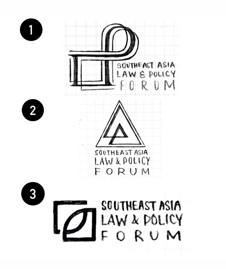
I first presented three concepts which were more static and "professional", drawing from the acronyms L and P for Law and Policy and integrating organic, curved elements such as the woven design in the first one. However, they did not stand out enough, which pushed me to come up with the final concept, a more dynamic and traditional-looking design with a contemporary twist.